The Buttons - Structure and Function
Each button has an icon and an explanatory text. This way, you will quickly recognize the function of the button.
|
|
Explanation |
Example |
|---|---|---|
|
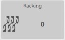
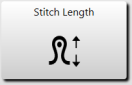
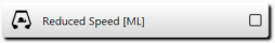
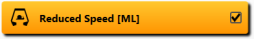
Single function |
|
|
|
| |
|
| |
|
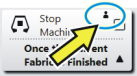
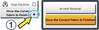
Double function |
Upper area of the button:
|
|
|
Lower area of the button:
| ||
|
Bubble Help (Tooltip) |
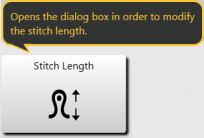
For most of the buttons there is a bubble help - if you remain a little longer on a button with the finger, an additional help text appears, which informs about the function of the button. |
|
|
Special case - button blocked |
The menu is locked. If a change is to be made, the password is necessary. |
|
 and
and 


 shows that the button (function) is password protected.